
InLinks has been on a bit of a journey these past couple of months. After a few key conversations, which you can read a little more about in Dixon’s post, we eventually acquired our .com domain. Around the same time, our InLinks trademark came through, meaning we now own InLinks in all the important ways.
All throughout this process, we have wanted to change our website to reflect our core values. These are friendly support, simple solutions to large-scale tech-SEO, and brilliant granular keyword research. What better time to update this than when we had to migrate everything to our brand new .com domain?!
So, we got straight to work on the new site. Here’s how we did it.
UX Testing
A huge part of this process was our UX testing. We pulled on the help of Luke, a highly skilled qualitative researcher, to ensure our website change had meaning and direction. During the process, we interviewed new and old SEOs at varying experience levels to see what they thought of the current site. This included who we are, what we do, how specialized we really are, and overall if they would be likely to sign up given the information on the .net site.
Our research was conclusive. Our site was old-fashioned, gave the impression that you needed to be an expert to use it and did not entice people to sign up. There was too much text and even those who had been in the industry for a long time and had many SEO tools in their arsenal could not fully grasp the concept.
For context, here is what the old website looked like:
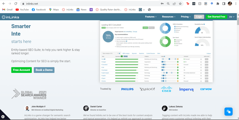
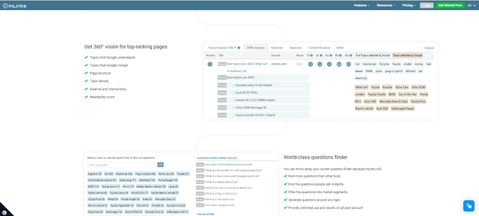
This just wasn’t good enough.
In our new design, we have put simple information first. We exist now for the user, to help everyone know the benefit of the tool in the first 10 seconds. Granted, we have a lot of features, and only a demo or getting stuck in can really reveal how helpful InLinks really is, but this new design sure does set everyone off on the right foot.
New Images
A huge part of this new change has been Kalle’s images. Kalle is a Finnish illustrator who helped us bring to life our lovely InLinks helpers. We as a company are cheeky and friendly, and the graphics associated with InLinks should reflect this. So, without further ado, meet Genie and Karim in Kalle’s beautiful images. We hope their plots, and plans help you enjoy your InLinks experience a little more!
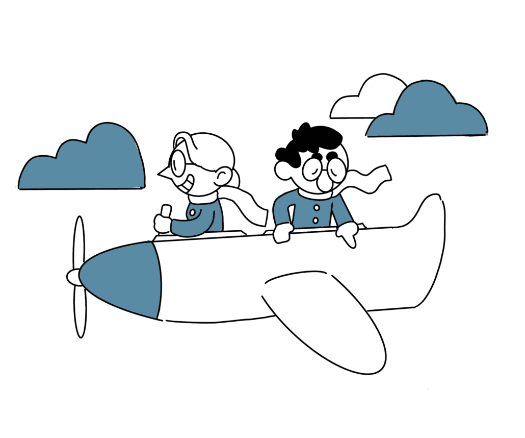
It would also be silly not to thank Grant Simmons for all the hard work he put into this migration. He lead the design of the new site and worked hard to make sure it looked exactly how we hoped.
So, there we have it. A new domain and a brand-new look that really considers what our users want. We will, obviously, be monitoring the success of this update and will let you all know how it goes.
To all of those reading who have been with us from the beginning, thank you for your continued support. It means the world to us. To those who have just found InLinks.com from our new website – welcome! We are so happy to help you out and provide scalable tech SEO solutions.
If you ever need a little bit more help, get in touch. We would be happy to provide you and your team with a 1-to-1 demo in which we can go over all the features of InLinks.

Leave a Reply
Want to join the discussion?Feel free to contribute!